

Unlocking the potential of your Shopify store's design often means thinking outside the box, or in this case, the screen. Welcome to a world where your image-with-text section stretches and breathes, taking up the entire stage. In this guide, we'll dive into the realm of Custom CSS to make your Shopify section a visual marvel. By the end, you'll have shoppers immersed in a seamless and engaging experience that's as expansive as your brand's imagination. So, let's push the boundaries of your online store and turn your image-with-text section into a captivating masterpiece that fills the screen and captures hearts.
Steps
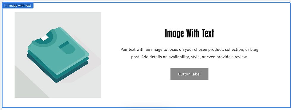
Step 1: Navigate to Image-With-Text
A pretty easy start! Scroll to the image-with-text section that you'd like to make full-screen and open up Custom CSS.
Step 2: Select Your CSS Class
Start by typing a . followed by the corresponding CSS class. In this case: image-with-text.
.image-with-text {
}
What is a CSS class?
It's used to select and apply styles to HTML elements that have a class attribute with the value "image-with-text." So, any HTML element like <div class="image-with-text"> would be affected by the styles defined within the curly braces.
Step 3: Define Max Width
Set the max-width to 100%. This a common technique used in web design to ensure that the element doesn't exceed its containing parent's width, which is particularly important when it comes to responsive web design.
When you set max-width: 100%, you're telling that element to never be wider than its containing parent element.
.image-with-text {
  max-width: 100%;
}
Step 4: Define Padding
Add padding to 0. Padding is the space between the content (in this case, the image) and its border.
By setting padding: 0;, you're essentially removing any space around the image, making it flush with its container or border. This is useful when you want the image to be positioned exactly at the edges of its container without any extra spacing.
.image-with-text {
  max-width: 100%;
  padding: 0;
}
There you have it! Harnessing the power of custom CSS in your Shopify store opens up a world of possibilities. With the insights you've gained in this guide, you're now equipped to transform an ordinary image-with-text section into a captivating, full-screen experience for your visitors. By applying these CSS techniques, you can tailor your Shopify store to better showcase your brand, products, and content. Your online presence is your canvas, and custom CSS is the brush that lets you paint a unique and immersive shopping experience.
Comments